When using a background image in your section, there are a couple ways to style that image right off the bat. You can use blend modes, gradient background overlays and enable parallax effects. Now, with Divi’s new scroll effects, you can take the animation one step further and beautifully combine a zoom-out effect with the parallax effect to greater another type of your dimension in your web design. To do this, we’ll use absolute positioned image modules and the viewport width unit. In this tutorial, we’ll guide you through the process by recreating a beautiful case study CTA design which you’re able to download for free as well!
Let’s get to it.
Preview
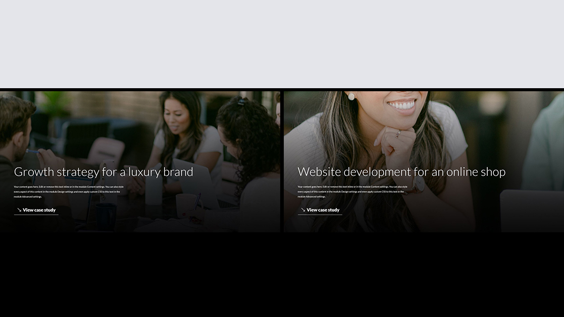
Before we dive into the tutorial, let’s take a quick look at the outcome across different screen sizes.
Desktop

Mobile

Download The Absolute Positioned Image Modules Layout for FREE
To lay your hands on the free absolute positioned image modules layout, you will first need to download it using the button below. To gain access to the download you will need to subscribe to our Divi Daily email list by using the form below. As a new subscriber, you will receive even more Divi goodness and a free Divi Layout pack every Monday! If you’re already on the list, simply enter your email address below and click download. You will not be “resubscribed” or receive extra emails.
Download For Free
Join the Divi Newlsetter and we will email you a copy of the ultimate Divi Landing Page Layout Pack, plus tons of other amazing and free Divi resources, tips and tricks. Follow along and you will be a Divi master in no time. If you are already subscribed simply type in your email address below and click download to access the layout pack.DOWNLOAD
Let’s Start Recreating!
Add New Section
Background Color
Start by adding a new section to the page you’re working on. Open the section settings and change the background color.
- Background Color: #000000

Sizing
Move on to the section’s design tab and change the width in the sizing settings.
- Width: 95%
- Section Alignment: Center

Spacing
Add some custom spacing values too.
- Top Margin: 5%
- Bottom Margin: 5%
- Top Padding: 0px
- Bottom Padding: 0px

Overflows
And make sure you hide the section’s overflows. This is an important step to making the tutorial work. By hiding the overflows, we’ll ensure that nothing surpasses the section container.
- Horizontal Overflow: Hidden
- Vertical Overflow: Hidden

Add New Row
Column Structure
Continue by adding a new row to your section using the following column structure:

Sizing
Without adding any modules yet, open the row settings and modify the sizing settings as follows:
- Use Custom Gutter Width: Yes
- Gutter Width: 1
- Width: 100%
- Max Width: 100%

Spacing
Remove all default top and bottom padding next.
- Top Padding: 0px
- Bottom Padding: 0px

Add Text Module #1 to Column
Add H2 Content
Then, add a first Text Module with some H2 content of your choice.

H2 Text Settings
Move on to the module’s design tab and change the H2 text settings accordingly:
- Heading 2 Font: Lato
- Heading 2 Font Weight: Light
- Heading 2 Text Color: #ffffff
- Heading 2 Text Size: 4vw (Desktop), 8vw (Tablet & Phone)
- Heading 2 Letter Spacing: 1px

Spacing
We’ll add some custom spacing values too.
- Top Margin: 25vw (Desktop), 50vw (Tablet & Phone)
- Left Margin: 5%
- Right Margin: 5%

Add Text Module #2 to Column
Add Content
The next module we need is another Text Module. Add some description content of your choice.

Text Settings
Move on to the module’s design tab and change the text settings as follows:
- Text Font: Lato
- Text Color: #ffffff
- Text Size: 0.8vw (Desktop), 2vw (Tablet), 3vw (Phone)
- Text Line Height: 2.1em

Sizing
Modify the width across different screen sizes next.
- Width: 800px (Desktop), 80% (Tablet), 90% (Phone)

Spacing
And complete the module settings by adding some custom margin values to the spacing settings.
- Top Margin: 2%
- Bottom Margin: 2%
- Left Margin: 5%
- Right Margin: 5%

Add Button Module to Column
Add Copy
On to the next module, which is a Button Module. Add some copy of your choice.

Button Settings
Then, move on to the design tab and style the button accordingly:
- Use Custom Styles For Button: Yes
- Button Text Size: 1.5vw (Desktop), 2.5vw (Tablet), 3vw (Phone)
- Button Text Color: #ffffff
- Gradient Color 1: rgba(255,255,255,0)
- Gradient Color 2: #ffffff
- Gradient Type: Linear
- Start Position: 98%
- End Position: 98%

- Button Border Width: 0px
- Button Font: Lato
- Button Font Weight: Heavy
- Show Button Icon: Yes
- Button Icon Placement: Left
- Only Show Icon On Hover for Button: No

Spacing
We’re using some custom spacing values across different screen sizes as well.
- Bottom Margin: 7vw (Desktop), 20vw (Tablet), 25vw (Phone)
- Left Margin: 5%
- Right Margin: 5%

Add Image Module to Top of Column
Once you’ve completed the first three modules in your row’s column, it’s time to add the absolute positioned image module and use it as a zoom-out background image. The first step to doing that is adding a new Image Module to the top of your column.

Leave Image Box Empty
Leave the image box empty.

Background Image
And use a parallax background image instead. You can use any image you want, but if you want to recreate the exact same outcome, you can find the images that were used in this tutorial by downloading the folder at the beginning of this tutorial.
- Use Parallax Effect: Yes
- Parallax Method: CSS

Sizing
Move on to the module’s design tab and force fullwidth.
- Force Fullwidth: Yes

Spacing
Add some custom top and bottom padding across different screen sizes too.
- Top Padding: 27vw (Desktop), 54vw (Tablet), 68vw (Phone)
- Bottom Padding: 27vw (Desktop), 54vw (Tablet), 68vw (Phone)

Position
Now, to make sure the module doesn’t take up any container space in our column, we’ll reposition the entire module in the advanced tab.
- Position: Absolute
- Location: Top Left

Scaling Up and Down Scroll Effect
And we’ll complete the module settings by adding a scaling up and down scroll effect.
- Enable Scaling Up and Down: Yes
- Starting Scale: 150% (at 30%)
- Mid Scale: 150% (at 45%)
- Ending Scale: 100% (at 55%)
- Motion Effect Trigger: Middle of Element

Clone Entire Section as Many Times as Needed
Once you’ve completed the first section, you can clone it up to as many times as you want.

Change Copy for Each Duplicate Section
Make sure you change the copy for each duplicate.

Change Image Module Background Image for Each Duplicate Section
Along with the Image Module background image and you’re done!

Preview
Now that we’ve gone through all the steps, let’s take a final look at the outcome across different screen sizes.
Desktop
Mobile
Final Thoughts
In this post, we’ve shown you how to get creative with Divi’s new scroll effects. More specifically, we’ve used absolute positioned Image Modules along with parallax backgrounds to create a beautiful section zoom-out effect. We’ve accompanied this tutorial with a beautiful case study CTA layout that you were able to download for free! If you have any questions or suggestions, feel free to leave a comment in the comment section below.